| Presentation format | Best for | Avoid when | Verdict |
|---|---|---|---|
| Descriptive statistics table (mean, SD, frequency) | Demographic profile, summarising every construct before deeper analysis | You have more than 8–10 rows on one page | Always include one, early in Chapter 4, before any inferential test |
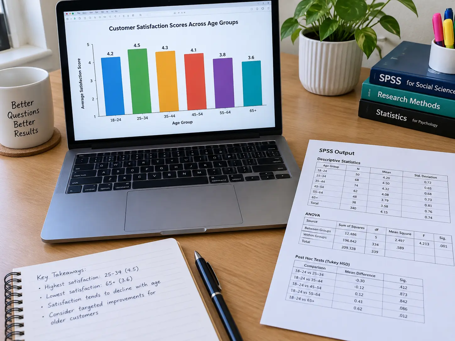
| Bar chart | Comparing categories (e.g. mean satisfaction across age groups) | You have a continuous variable or a trend over time | Best single chart for group comparisons |
| Line chart | A trend over time (e.g. purchase intention across three survey waves) | Your data has no time or ordered-sequence dimension | Use only if your design is genuinely longitudinal or has ordered stages |
| Correlation/regression table | Reporting relationships between variables (r, β, p-values) | You only have one variable, or purely descriptive objectives | Mandatory for any hypothesis-testing survey design |
| Pie chart | A single categorical variable with few (3–5) categories, e.g. gender split | More than 5 categories, or you need precise comparison between slices | Use sparingly — a bar chart is usually clearer for the same data |
| Scatter plot | Showing the actual relationship behind a correlation coefficient | You have no continuous-by-continuous variable pair | Include at least one for your key relationship, alongside the r value |
What goes in Chapter 4 first, before any statistical test?
This builds on the general structure in how to write the results chapter of your FYP or thesis, scoped specifically to a survey-based Marketing design. Start with your response rate and a demographic profile table (age, gender, income band or whatever categories your sample naturally divides into), reported as frequencies and percentages. This step is easy to skip in a rushed Chapter 4, yet it orients the reader before you introduce any construct, and it is also where a reviewer checks whether your final sample matches what you promised in Chapter 3 — if your target was 200 responses and you report 150, this is where you address the gap and its implications, not bury it in your limitations section three chapters later.
How should I present descriptive statistics for my constructs?
One table per construct or one combined table for all constructs, reporting mean, standard deviation, minimum and maximum for each item or sub-scale — not just the overall scale mean. A reader comparing your constructs needs the spread (SD), not just the average, to judge whether responses clustered tightly or spread widely; a construct with a high mean and a high SD is a genuinely different finding from a high mean with a low SD, and your discussion chapter should address that difference explicitly if it appears.
When should I use a bar chart versus a table for the same data?
Use a table when the reader needs exact numbers (a supervisor checking your arithmetic, or numbers you will reference again in your discussion) and a bar chart when the reader needs to see a pattern at a glance (which group scored highest, how far apart the groups are). A frequent mistake in Marketing FYPs is presenting the same comparison as both a table and a chart on the same page — pick one for each specific comparison, and reserve the pairing only for your single most important finding, where showing both the exact numbers and the visual pattern earns its space.
How do I present a correlation or regression finding correctly?
Report the coefficient (r or β), the significance level (p-value), and the direction and strength of the relationship in words, not just the numbers in a table — an illustrative sentence such as “brand trust was positively and moderately correlated with purchase intention (r = .42, p < .01)” tells the reader what the table means, rather than leaving them to interpret r = .42 unassisted. Pair your key correlation or regression table with a scatter plot for your single most important relationship; this is the one place a figure genuinely adds something a table cannot, since a reader can see the shape of the relationship (linear, clustered, an outlier pulling the line) that a coefficient alone hides.

Which figure mistakes do examiners flag?
A chart that duplicates a table already on the same page or the page before, with no new information added — examiners read this as padding rather than analysis. Another: a chart with no axis labels, no units, or a legend that does not match the chart’s actual categories, usually from copying a template without updating it for your own variables. Before you finalise Chapter 4, check every figure against this rule: if you covered your table of numbers with your hand, would the chart alone still tell a reader something useful? If not, cut the chart or replace the table with it — never keep both saying the same thing.
How many decimal places and what rounding convention should I use?
Two decimal places for means, standard deviations and correlation coefficients is a widely used convention (APA style, for example, reports most statistics to two decimals), and percentages are often reported to one decimal place; check your faculty’s own guide first. Whatever you choose, keep it consistent across every table in the chapter — a table with means to two decimals sitting next to one with means to one decimal reads as inconsistent proofreading, which is a small thing that nonetheless signals a rushed final pass to an examiner comparing tables across your chapter.
Should I report effect size alongside significance for a survey-based Marketing FYP?
Yes, wherever your statistical test produces one (Cohen’s d for a t-test, eta-squared for ANOVA, R² for regression) — a p-value alone tells a reader whether a relationship is statistically significant, not whether it is practically meaningful, and a large sample can make a trivially small relationship statistically significant, which is a distinction examiners can probe at the viva when a p-value looks impressively small but the underlying relationship is weak. Reporting the effect size alongside the p-value lets your discussion chapter make a genuine claim about how much a variable matters, not just whether it matters at all — see which statistical test to use for your FYP data for how effect size fits alongside the test itself.
What software should I use to build these tables and charts?
SPSS’s chart builder handles every format in the comparison table above, and its output can be pasted into Word and edited — a common choice for Marketing FYPs for exactly that reason. See the statistical software comparison for a Malaysian FYP or thesis if you are still choosing between SPSS, JASP, R and Excel; whichever you pick, export charts at a resolution that stays sharp when printed, not just legible on screen — a chart that looks fine on your laptop and pixelates on a printed softbound copy is a formatting defect an examiner will notice.
How does this connect back to my research proposal’s objectives?
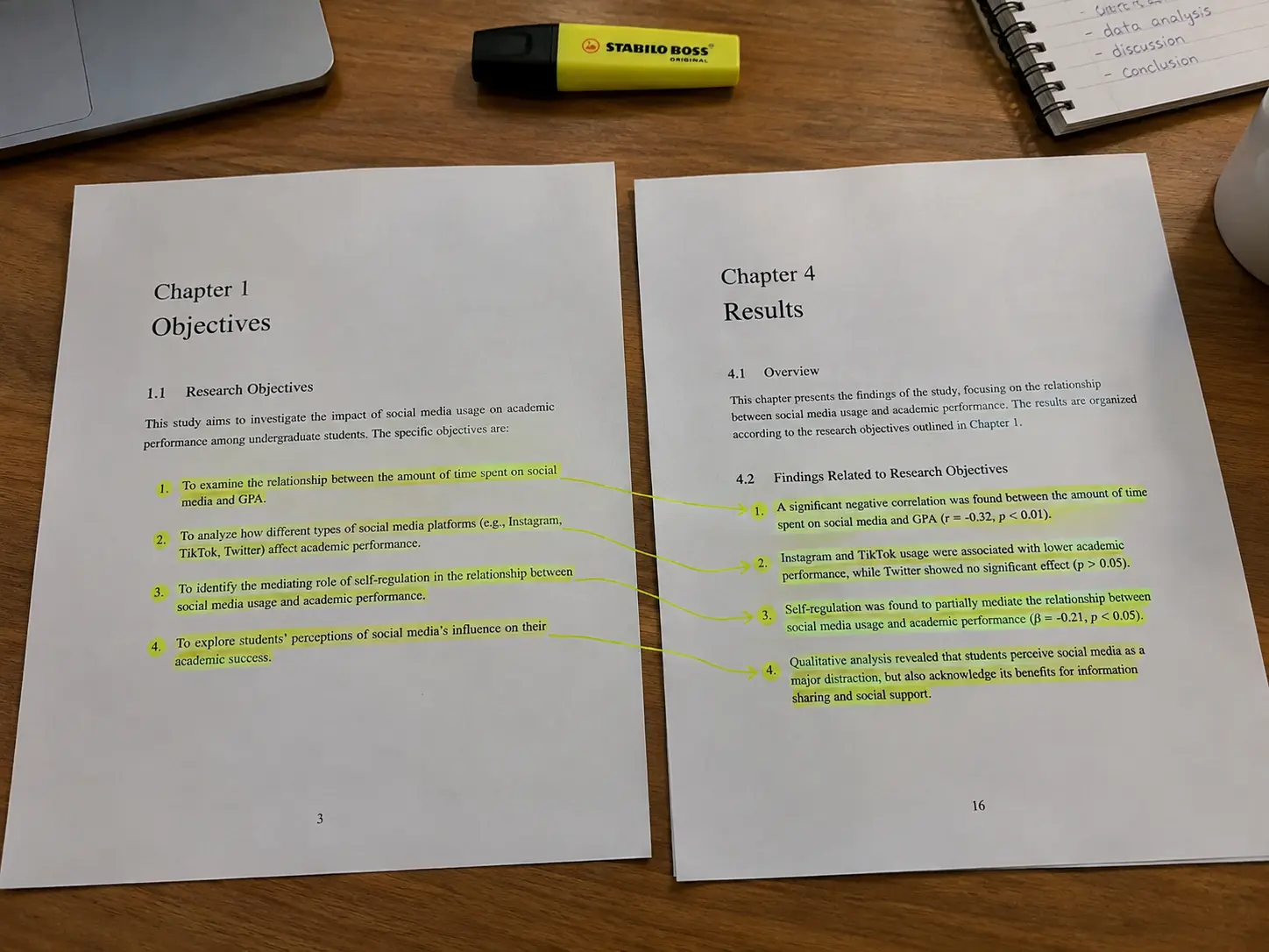
Every table and chart in Chapter 4 should trace back to a specific objective or hypothesis stated in your proposal — if you find yourself building a chart that does not answer one of your stated research questions, it does not belong in the chapter, however interesting the pattern looks. This is the same discipline covered in what a research proposal for a Marketing FYP should include and in how to write operational definitions for a Marketing FYP: the variables you operationalised in Chapter 3 are exactly the variables your tables and charts in Chapter 4 should report on, in the same order, so a reader can follow the thread from objective to operational definition to finding without having to search for it.
One more habit that separates a strong Chapter 4 from an adequate one: order your tables and figures to match the order your objectives appear in Chapter 1, not the order you happened to run the analyses in SPSS. A reader moving from your problem statement through your objectives into your results should find finding one answering objective one, finding two answering objective two, and so on — reordering your output to match this sequence takes an hour and makes the entire chapter read as a coherent argument rather than a printout of whatever SPSS produced in whatever order you clicked through the menus.
Where Tesify fits into this workflow
Tesify helps you plan and draft Chapter 4 in the order of your objectives, with each finding written up in plain language next to its table or figure, while every analysis decision and every word you keep stays yours, so the chapter remains 100% written by you. More than 9,000 students have used Tesify, across 15,000+ chapters.
Frequently asked questions
What should be the first table in my Chapter 4?
Your response rate and a demographic profile table (frequencies and percentages), before you introduce any construct or statistical test.
Should I report both a table and a chart for the same comparison?
Only for your single most important finding — for every other comparison, pick whichever format (table for exact numbers, chart for pattern) best serves that specific comparison, not both.
What statistics should I include in a descriptive statistics table?
Mean, standard deviation, minimum and maximum for each item or sub-scale, not just the overall scale mean — the spread matters as much as the average.
When is a bar chart better than a pie chart?
Almost always when you have more than 3–5 categories, or when precise comparison between categories matters — a bar chart makes small differences between categories easier to judge accurately than a pie chart does.
How should I write up a correlation finding in the text, not just the table?
State the coefficient, its significance level, and the direction and strength of the relationship in plain language — for example, “positively and moderately correlated” alongside the r and p values.
Do I need a scatter plot if I already have a correlation table?
For your single most important relationship, yes — a scatter plot shows the shape of the relationship (linear, clustered, an outlier) that the coefficient alone cannot.
What figure mistakes should I avoid in a Marketing FYP results chapter?
A chart that repeats a table already shown nearby with no new information, or a chart missing axis labels, units, or an accurate legend.
How many decimal places should I use for statistics?
Two decimal places for means, standard deviations and correlation coefficients is a widely used convention, often with one decimal place for percentages; follow your faculty’s guide and keep it consistent across every table in the chapter.
Do I need to report effect size, or is a p-value enough?
Report effect size wherever your test produces one — a p-value shows statistical significance but not practical importance, and effect size lets your discussion make a genuine claim about how much a variable matters.
Should my demographic profile table match what I promised in Chapter 3?
Address any gap directly here — if your target sample size or composition differs from what you planned, explain it in Chapter 4 rather than leaving it for your limitations section.
What software is commonly used for these charts in a Malaysian Marketing FYP?
SPSS’s chart builder is a common choice because its output can be pasted into Word and edited, though JASP, R and Excel can all produce the same chart types.
How do I make sure my Chapter 4 tables connect back to my proposal?
Trace every table and chart to a specific objective or hypothesis from your proposal — the variables you operationalised in Chapter 3 should be the same variables your Chapter 4 tables report on, in the same order.